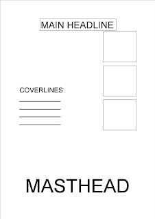
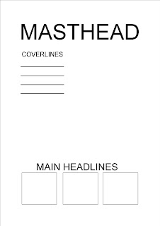
 Here are two drafts I have uploaded, they are both different in their colour schemes but have the same layout. The first one is very bright and vibrant which may attract young readers, however the second one is more sophisticated and has much more subtle colours. Can you let me know what you think please, thank you :)
Monday, 30 November 2009
First Drafts
 Here are two drafts I have uploaded, they are both different in their colour schemes but have the same layout. The first one is very bright and vibrant which may attract young readers, however the second one is more sophisticated and has much more subtle colours. Can you let me know what you think please, thank you :)
Tuesday, 24 November 2009
Layout Designs
Here are four initial design ideas that I have uploaded for the main layout for the front cover of my magazine. Any feedback from the audience would be a great help, such as what you would like to see and what would be most eye catching. I will also be incorporating the price of the magazine, issue number, bar code, and any other extras on the front cover. A main photograph will also be taking up most of the central space as a background for the cover.
1

2

3

1

2

3

Friday, 20 November 2009
Weekly review
This week I am pleased with my progress as I have managed to keep up to date with my action plan and get everything that I wanted to do, done. I have researched two existing magazines, taking into account the use of colour, layout, fonts and images they have included. This helped me into thinking of ideas for what my magazine cover and contents will be like, and what will make it appealing to my audience. I have decided on a target audience, which is 16 - 18 year olds. I also created an audience questionnaire that people filled out - this helped me decide what to write for my cover lines and contents pages. I also had some spare time to prepare what kind of photos I want to take in my photo shoot next week. I do not feel like I am behind at all with my plan, and I hope next week goes just as well! :)
Target Audience
From my questionnaire results, I have decided that the most suitable audience to aim for is 16 - 18 year olds, as all of the people who filled it out, were of that age. It would also be a lot easier for me because I am 16, so I can relate my magazine cover design to what would attract me to buy it and what I would like to read. I will use bright colours in my front cover, perhaps graffiti style writing, and teenage related images to ensure that my magazine catches the eye of the youthful audience.
Wednesday, 18 November 2009
Textual Analysis - Smaart Talent

The picture on the cover of this magazine is of a young woman blowing a bubble out of gum, this instantly portrays fun and youthfulness, which would make teenagers want to read it. A graffiti style font is used above the two cover lines to relate the magazine to a teenagers style. However a simple colour scheme of brown, pink and white is used; this makes the magaine come accross as sophisticated, classy and slightly more grown up than many other student magazines.
The picture is a midshot, and the girl in the picture is looking straight at the camera, this conveys eye contact to try and engage the audience. There is a double meaning of the word 'pop' on the front cover of the magazine; popping of the chewing gum, and pop music that the article will be about. The title of this magazine is 'Smaart Talent'. This is a clever title as it is aimed to make readers think they will be smart if they read the magazine, and also the word 'art' is encorporated in the title which might give the audience a creative boost if they read it.
Bold fonts are mostly used to again attract the potential audiences attention and encourage them to buy your magazine, and around the title there is a shiny effect which catches your eye as you look at it. The cover lines on the magzine are all based around the theme of education - careers, uni, courses etc, which furthermore would make teenagers feel intelligent if they were to read it.
Tuesday, 17 November 2009
Textual Analysis - Student ID

I decided to research and analyse some existing student magazines; this one is called Student ID and is a student magazine for Ludlow College.
I think the yellow and black contrasting colours work really well together as they grab the eye of the audience and make you want to read it. I also think that bright colours such as yellow, give the magazine a youthful and energetic feel which would again attract teenage students.
The cover lines on the magazine are interesting and interest the readers into reading more, enhanced by the use of bold fonts. The pictures that have been used on the cover, are of students having a good time on a night out. The camera shots that have been used are mid close ups so you can see the expressions on their faces and to portray that they are all having a good time.
The whole magazine at first appearance has a teenage theme to it, and the image on the left is some sort of spinning wheel which again portrays fun and movement.
Monday, 16 November 2009
Audience Questionaire
Could you copy and paste this and answer the questions to help me with my student magazine task please :)
Age?
Age?
- 14 - 16
- 16 - 18
- 19 +
- Male
- Female
Do you currently read any student magazines at the moment? If yes, which ones?
- No
- Yes .............................
Which of the following subjects would you most like to read about?
- Music/Concerts
- Love
- Education/College
- Fashion
- Going out
- Film/Television
- Real life/Embarrassing stories
- Other - Please state
How much would you be willing to pay for a student magazine?
- Less then 50p
- 50p - £1
- £1 - £2
- Other - please state
Any other comments?
Thank you :)
Action Plan
For my first media course work project, I have been asked to design and create a front cover and contents page for a student magazine. To ensure I will be aiming for the right target audience, I will research existing magazines to take into account what kind of layout, colour and context is being used. My main task later on, is to create a music magazine, therefore I don't want to use all of my ideas on this task, so i will have to be careful which elements I choose to include. I have four weeks in total to finish my front cover and contents page, and here is my action plan to ensure I will keep up to date, with the task given.
Week 1
In the first week I will research existing student magazines to give myself ideas and inspiration for mine. I then need to decide on a target audience to ensure I attract the right type of people. I will also create an audience questionnaire, and ask people to fill it out, in order to know what people will want to read about in my magazine. If I still haven't thought of a name for my magazine, I may also create a poll with various magazine names I could use and see which name receives the most votes. If I have time I will look through some mock designs so I know what to expect in my final piece.
Week 2
This week I will begin to design my front cover and contents and experiment with different fonts and layouts. Once I have decided on what image I would like to be on my front cover, I will need to organise a photo shoot perhaps with my friends, so I have a number of pictures to choose for my main front cover picture. I will then probably have to edit these photographs in a computer programme, tweaking them and making them how I want them to be. In addition to this, I will need to decide which colours I will use - complementary or clashing, however this will depend on which colours are in my photograph.
Week 3
By week 3 I will have hopefully completed my first draft. I will then ask for feedback from my decided target audience and make any necessary changes to my front cover and contents. By the end of this week my aim is to be completely happy with my designs for the cover and contents.
Week 4
In the final week I will finish any unfinished work and also I need to evaluate my final piece, and answer any questions about the task that I will have just completed. I will read over all of my research and work and make any necessary changes. I have now completed task 1 :)
Subscribe to:
Comments (Atom)

